Case Study
RideJAX
A highly accessible, mobile-first design system and technical buildout for a public transit rebrand.
- Technical Implementation
- Visual Identity
- Art Direction
- Accessibility
Never miss your bus on the road.
RideJAX is the hub for mass transit in Jackson County, Illinois, home to the Shawnee National Forest. As part of a larger rebrand, it needed an information architecture overhaul so riders could make sense of route information more easily. Working alongside 2 partner agencies, we led design and development and served as the bridge between both teams.
The site was designed mobile-first for quick route checks on the go, with WCAG Level-AAA contrast on every text block and a 100/100 Lighthouse score.
View the workBrisk, orderly, and punctual.
Bold, striking, and powerful.
Primary colors WCAG AAA
Accent colors
Neutral colors
Bold, utilitarian, and clear.
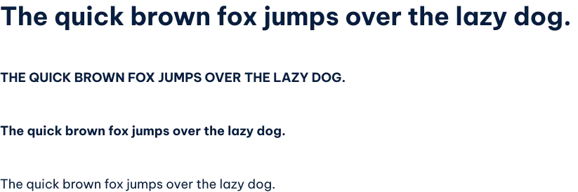
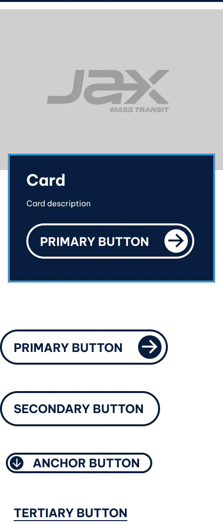
High-contrast, tactile, and rider-ready.
Up Next
Taylor Studios
A CMS migration, digital brand expansion, and reusable WordPress theme for a $13M exhibit design and fabrication company.
- Technical Implementation
- Visual Identity